If you have experience working in Excel, you know that data occasionally needs to be restructured for various reasons. It may need a slight revamp to accommodate changes, such as the addition or removal of information. It can also become disorganized or otherwise difficult to navigate as it is scaled over time and edited by different users. Or, maybe, the original version of a data set is poorly arranged, which then requires a complete, top-to-bottom formatting overhaul.
Depending on the size of your data set(s), restructuring missions can be long and intense processes. If you’re not very familiar with Excel best practices, jumping in headfirst may lead to formatting issues that are tedious to undo. Working in Excel isn’t difficult, but it can be tricky if you’re new to the tool or don’t have much experience working with other types of data programs. Before you get started, it’s advised that you brush up on a few of the “dos and don’ts” of restructuring data, specifically in Excel.
That’s why I’ve put together a list of tips and tricks that can help you more quickly and efficiently restructure your data. I’ll also touch on the most common mistakes people make during reformatting and restructuring, so you can prevent them and save your future self from hours of reversing avoidable errors.
Keep reading to find out more about my top “Dos” and “Don’ts” for restructuring data in Excel.
The “Dos”
Do: Store your information in rows and separate it into different columns.
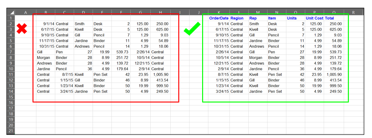
Your data should be grouped and separated by type
As part of the restructuring process, you want to make sure that your data is separated into appropriately labeled columns and rows. Each category (name, region, item, etc.) should have its own column and/or row and individual entries should be in their own cells.
In the above example, the second table’s first column is dedicated to the dates in the data set, and these dates are separated into individual rows and cells to indicate that they are separate entries. In the first table, you’ll notice that the data for dates, names, and units are scattered among the columns. Since the columns are not labeled and data is not clearly grouped together, although you can take a guess, there’s no real way to verify which pieces of data are connected and how.
Do: Use Excel tables and not auto-sort lists.
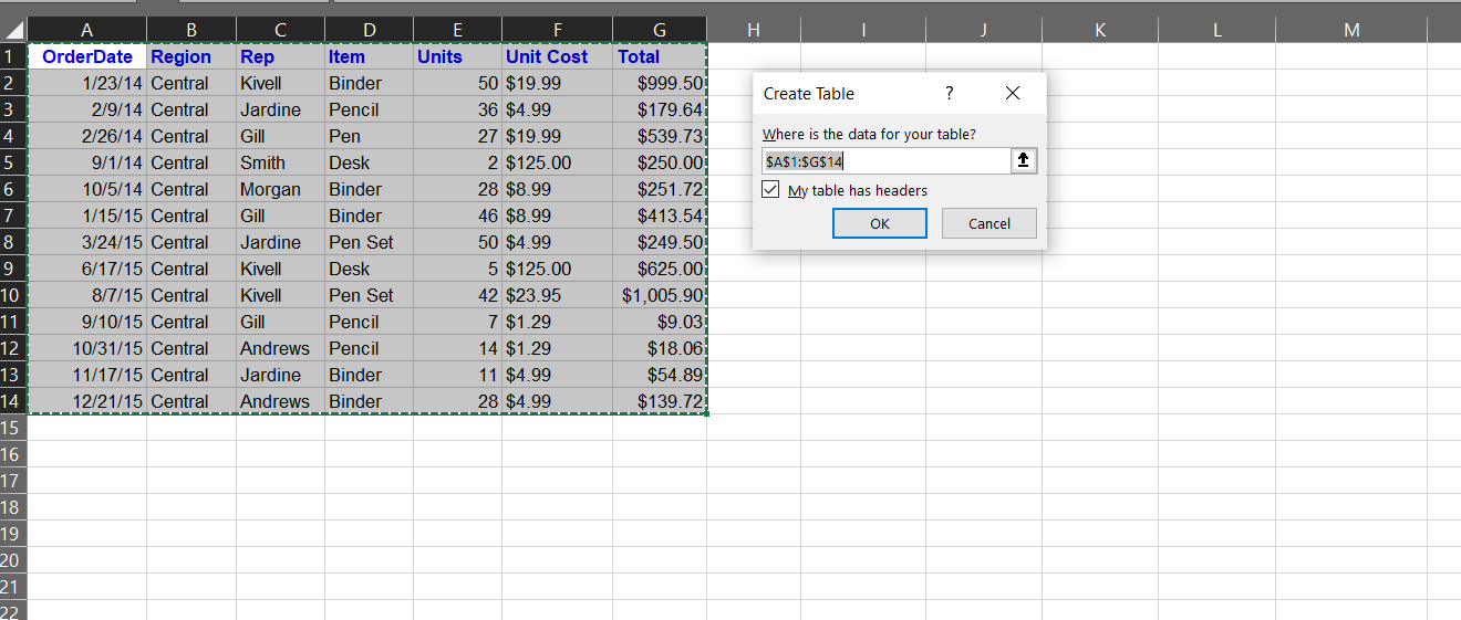
Convert your data into a table using Ctrl+T or the Insert tab
If your data isn’t already in an Excel table, your next step will be converting it into one. To do this, just click Insert>Table and set the new table’s parameters. Make sure that the My table has headers box is clicked so your header text is read properly and not converted into the first row of data for your table.
Auto-sort lists aren’t recommended during data restructuring. Any auto-sorting that you do will need to be undone to prevent function errors as you rearrange your table’s columns and rows. Since the auto-sort formulas are linked to specific columns, rows, and cells, any changes made to the table will negatively affect the accuracy of your table values. If you’d like your data auto-sorted anyway, you’ll want to wait until after it has been restructured and the format is finalized.
Another bonus to converting your data from free text to tables is that column headings make it easier to read any included formulas. Since column headers are named, the guesswork of understanding the logic behind each formula is removed. The formulas (and the data overall) can instantly be read more intuitively.
Do: Intuitively name your Excel tables.
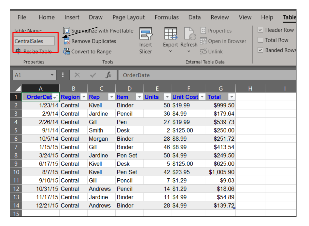
Name each table after its contents for easier restructuring
Restructuring data can be complicated, and working with tables with misleading, hard-to-read, or confusing names adds an unnecessary level of complexity.
If you have a table of data covering total sales that employees have made in a month, stay away from vague names like “Table 1”. When you’re struggling later to recall what data “Table 1” actually represents, you’ll regret not being more specific.
Instead, avoid ambiguity and give each table a name that is indicative of its data contents. For example, opt for table names like tbl_Sales, tbl_Employees, tbl_Clients, Overtime_2021, etc.
You won’t be able to use spaces in your table names, so substitute dashes, commas, and underscores in their place.
Do: Remember to plan for the future.
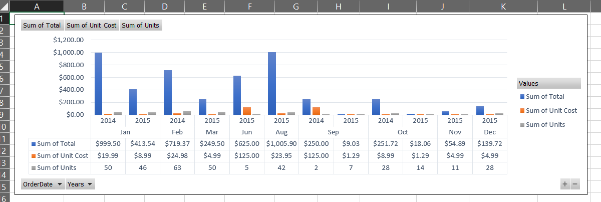
Use a pivot chart or timeline slicer to visually represent your data
If your data set is separated into multiple time periods, best practice dictates that you don’t spread these various time periods across more than one tab. Instead, as you format your data, include a “Date” column of some sort that can help you differentiate between data sets where time is of importance.
From there, there are a few ways that your data can be organized. You can insert a pivot chart as a visual representation of your information, with the date on the x-axis – ideal for quick and easy data assessment. You can also apply a “Timeline” slicer (filter) to the “Date” column and view specific time periods (day, month, year, and/or quarter) when you need a more in-depth view of the data. Combining these methods is also useful (and highly recommended) since one method can be used in lieu of the other, as necessary.
Do: Separate flat data entry fields from calculated fields.
As general practice, keep text-based data to the left and calculated data to the right
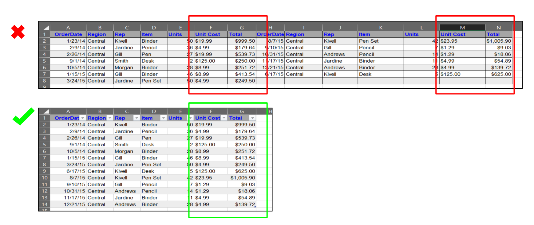
If you have data fields that contain calculations (read: formulas), these should be separated from the fields that contain only text. In the first table in the example, flat data and calculated data within the same columns, which is difficult to read and more challenging to navigate when adding or removing information from the data field. The second table’s data has been grouped and separated, with the calculations on the right and the flat text on the left. Since most languages are read from left to right, and text-based columns usually explain or refer to the calculations, arranging the data this way is a well-held best practice.
Diving Into the Don’ts
DON’T: Arbitrarily separate your related data by tabs or individual sheets.
Separating related information into multiple sheets makes reading data more challenging
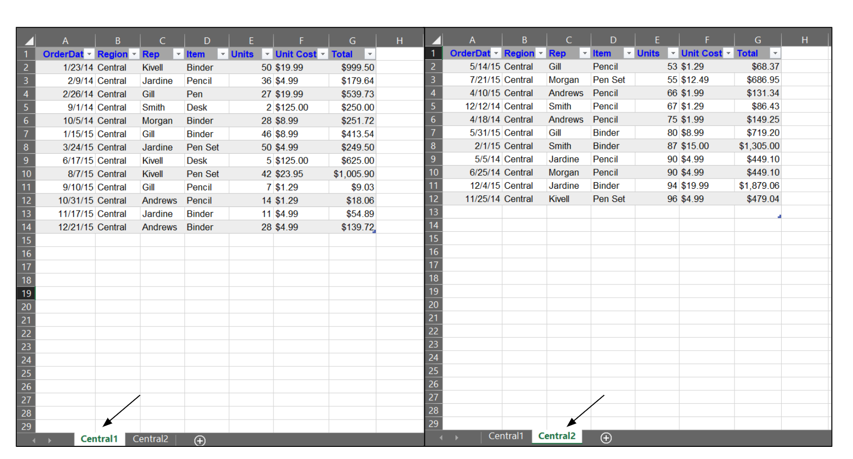
Spreading data out over many tabs (or sheets) is a mistake people make quite often when trying to restructure their data. But, separating information this way can make it more challenging to interpret. Although separating data sets can simplify the organization of your data, not all data is easier to manage across several tabs. It also makes it more difficult to create accurate charts and pivot tables to illustrate the data.
The best way to decide between one tab or multiple tabs is to ask yourself if separating the data will make it more challenging to understand or interpret the information in the data set. If the data is related, using multiple tabs can add a layer of inconvenience and create an unnecessary step in assessing the data set.
A practical example? If you have a data set that includes expenses, sales, clients, and employees, you’ll want to find an intuitive way to group and separate this information. For the “expenses” and “sales” data, you can create a “Transactions” table to house these data sets and track both sets of information. The other two data groups, “clients” and “employees”, can now be placed in a separate table, which can then (if needed) be moved to its own tab.
DON’T: Use blank rows and columns to separate related data
Blank rows and columns should never be used to separate related data sets
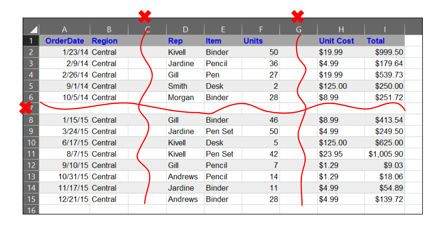
Related data should not be separated using either blank rows or blank columns. These blank spaces can falsely indicate to the viewer that the separated information is not related, interfering with how accurately the data is read and understood. Plus, if you need to convert data into a pivot table or a chart, the empty rows and/or columns won’t be accurately read by Excel. Err on the side of caution and keep your data free from unnecessary blank spaces that may affect formatting or comprehension.
However, if the data is not related, you can separate it into different tables and even different tabs, if needed.
DON’T: Use colors to identify or separate data.
Use labeled columns, and not colors, to distinguish between data categories
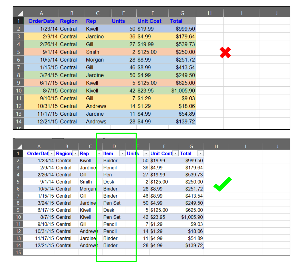
Instead of separating data by color (which may be tempting), use columns to differentiate between categories. Separating by color isn’t foolproof – even if you create a key, identifying categories this way isn’t practical. You’ll either spend chunks of time referencing the key to ensure that you’re handling the right data/data set, or you’ll have to memorize each category/color combination. If your data contains more than a few categories of information, memorization may be nearly impossible (or just not worth the effort).
Another reason to stay away from using color to identify data? It’s impossible to accurately report using either a Pivot Table or a Pivot Chart. If you want to add color to your spreadsheet, you can do so by navigating to Table Design>Table Styles and choosing from the range of options or by creating your own.
DON’T: Allow free-form text entry whenever possible.
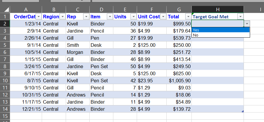
Your data should be grouped and separated by type
Whenever you can use dropdown lists instead of free-form text entry for your tables and spreadsheets, choose the dropdown lists! Of course, this won’t always be possible, but if you’d like to increase the speed and efficiency at which users can enter repeated text during data entry, dropdown lists are the way to go. You can also use these lists to limit the entries that can be made in a cell to force consistency across your data.
To do this, select the cells you’d like to add a dropdown list to and navigate to Data>Data Validation and select List from the “Allow” dropdown menu. You’ll then need to type out each entry you’d like added to the list, separating each one by a comma. Major errors are much less likely to occur when using dropdown lists, since only the approved source text can be selected and added to the designated cells.
DON’T: Have multiple data types in a single column.
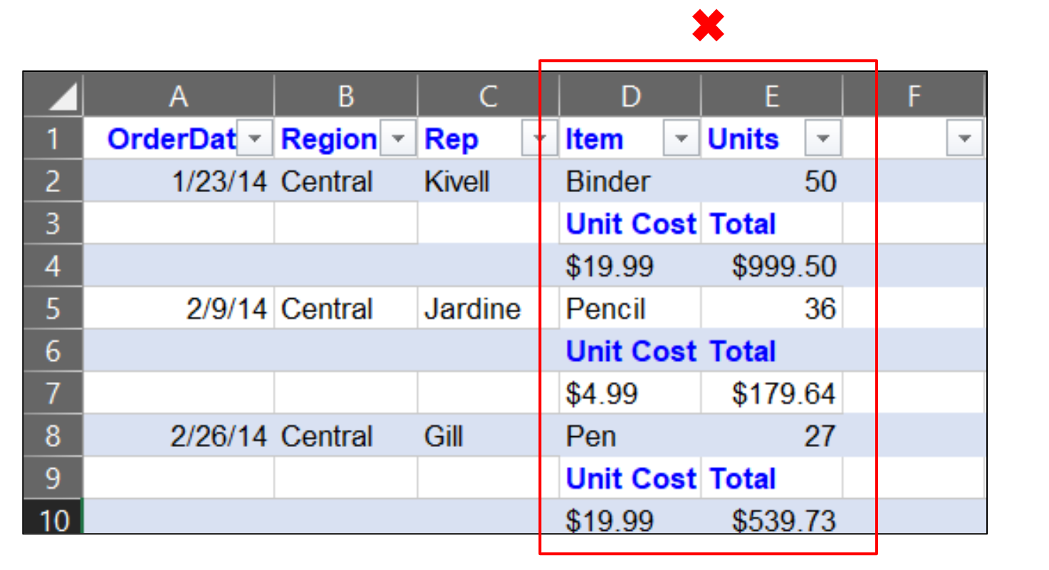
Avoid having more than one data type (date, time, currency, etc) in one column
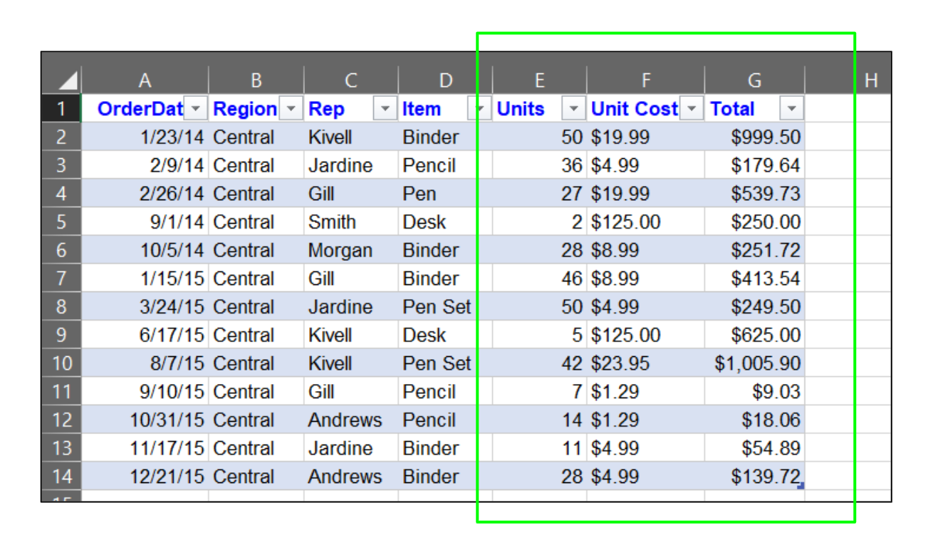
Keep flat and calculated text separated into designated columns
In much the same way that flat and calculated data sets should be separated, you should make sure that multiple types of data are never placed in a single column. Consistency is key in Excel, and assigning specific columns for each data type is one way to prevent formatting issues and function errors.
Doing this will also save time during data entry – simply select an entire column, choose its data type, and every entry you make in that column will be automatically converted. Manually assigning data types to various cells and rows in a column is counterproductive to Excel’s purpose – simplifying complex and mundane processes.
Final Thoughts
Restructuring data won’t always be easy, but there are ways to make the process smoother and less issue-prone. You don’t have to be an expert in Excel to reformat and rearrange data, especially if you keep these key tips in mind. In no time, you’ll have created a more practical and intuitive data structure, designed for effortless navigation and scaling of your data for years to come.


